
The Anatomy Diaries: July 2025
- India Fradgley
- Jul 28, 2025
- 5 min read


1. Heart Cross-Section Study
This week (07/07/25 to 12/07/25), I directed my creative time towards producing a 2D cross-section of the heart.
Though I planned on creating a 2D piece I chose to make use of 3D references of heart cross-sections to review the intricacies of the heart’s internal structure. I produced this piece with ’Affinity Designer 2’.
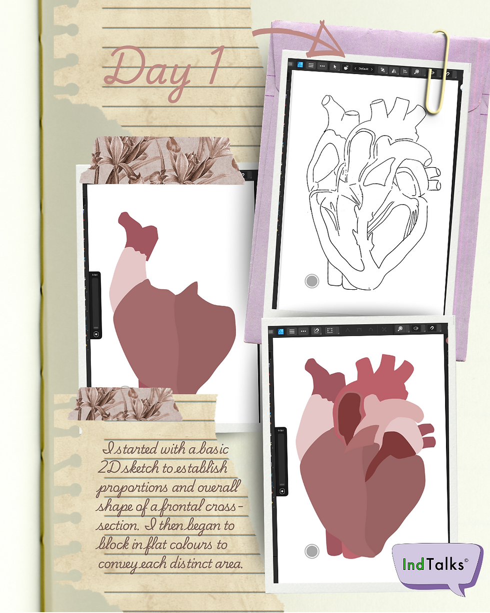
On day 1, I started with a basic 2D sketch to establish proportions and overall shape of a frontal cross-section — showing all four chambers, the valves, and major vessels. Getting the orientation of the left and right sides correct was more difficult than expected, especially with how the septum curves slightly.
I began to block in flat colours to convey both ventricles and atria, swiftly followed by the aorta, superior vena cava and the pulmonary veins.
Following this on day 2 and 3, I added the chordae tendineae and valves. With so many overlapping forms portrayed at this point, it was easy to lose clarity. However, rather than using high-contrast colour, I chose a range of muted reds and pinks to visually separate the internal forms while keeping the overall tone anatomical and realistic.

On day 4, I used deeper shades of red to represent the papillary muscles, applying the colour in a segmented, structured way to reflect their distinct form within the ventricular wall.
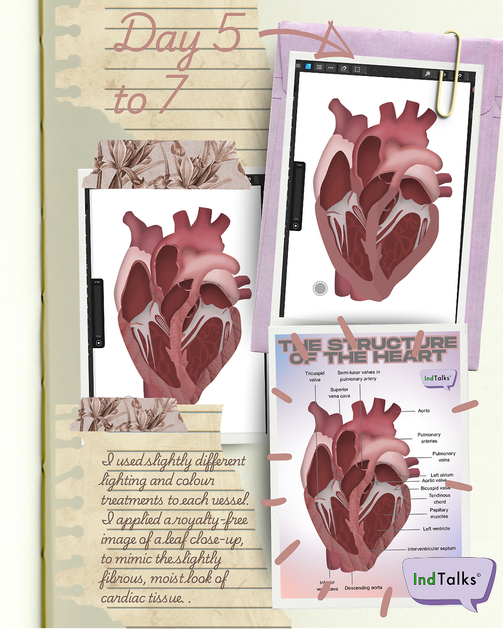
On day 5, I used slightly different lighting and colour treatments to each vessel – warmer highlights and deeper shadows for the aorta to suggest its muscular wall, and cooler, more subtle shading on the vena cava and pulmonary veins to convey their thinner structure.
On day 6, I applied a royalty-free image of a leaf close-up, to mimic the slightly fibrous, moist look of cardiac tissue. I used a variety of ‘Adjustments’ tools within ‘Affinity Designer 2’. I used the following tools to achieve the effect I desired:
Lens Filter
Recolour
Shadows & Highlights
Brightness & Contrast
I feel this gave the piece a more organic feel without overcomplicating the anatomy.
On day 7, once the heart cross-section was finished, I added labels to turn it into a clean diagram. It helped me visualise and reinforce the anatomy, and also gave the piece a clear educational angle.
With hindsight, there are a couple of things that I believe could be improved within this piece of work. For instance, one of my major critiques would be if I were aiming for absolute accuracy, the left ventricle wall would have been significantly thicker than the right. I think I was so focused on getting the shape correct that I didn’t consider the proportion as much as I thought I had.
Eventually, I’d like to layer in muscle fibre direction and maybe even include surrounding structures like the pericardium or lungs.
2. Cardiac Tissue Cross-Section Study
On the afternoon of 18/07/25, I decided to play around with the idea of a second infographic to pair with the labelled heart cross-section diagram I had produced. From this I chose to focus on the cardiac muscle tissue but in a semi-realistic style – retaining the key anatomical structures like branching fibres, intercalated discs, and striations, while avoiding microscopic detail.

I observed clear 2D depictions of cardiac muscle tissue cross-sections and light microscopic images. I produced this piece with ’Affinity Designer 2’.
I began with a basic 2D sketch to establish proportions and overall shape. I then blocked in flat colours in the basic orientation of the muscle fibres, following the natural diagonal striations characteristic of cardiac tissue.
As a stylistic choice, the intercalated discs – while an essential feature of cardiac muscle – I only depicted them along the outer edge of the drawing. This keeps the central area uncluttered and focused on the broader pattern of fibre flow. Their placement at the edges hints at their presence without overwhelming the composition.
I should add, in order to depict the intercalated discs, due to their complex, textured appearance with their composition of specialized cell junctions, I chose to use a royalty-free image of a sponge as a texture overlay. The porous texture of the sponge subtly echoed the irregular pattern of the intercalated discs. I utilised the ‘Lens Filter’ from ‘Adjustments’ to keep the effect subtle.
Colour-wise, I used muted pinks for the myofibrils and yellows for the mitochondria to give the muscle warmth and realism. I made use of a deep red to highlight the nucleus. I also incorporated a 3D ‘FX’ overlay, giving the piece added dimensionality. This subtle effect brings depth to the surface texture.

Finally, once I completed the drawing, I created an infographic to help summarise and communicate the key features of cardiac muscle in a clear, accessible format. The goal was to take the semi-realistic artwork and build a visual learning tool.
Upon reflection, I gained confidence in using photo textures creatively to imply biological structure. Also, although limiting the intercalated discs to the outer edge worked stylistically, I’d like to test ways of subtly integrating them throughout the tissue without overwhelming the composition – maybe through a more transparent texture layer or finer line work.
3. Skeletal Head Study
From 23/07/25 to 25/07/25, on a bit of whim I focused on my first real attempt at a 3D drawing, and chose to study the human skull.
I found a few detailed references on SketchFab, and made use of the application ‘Nomad Sculpt’.
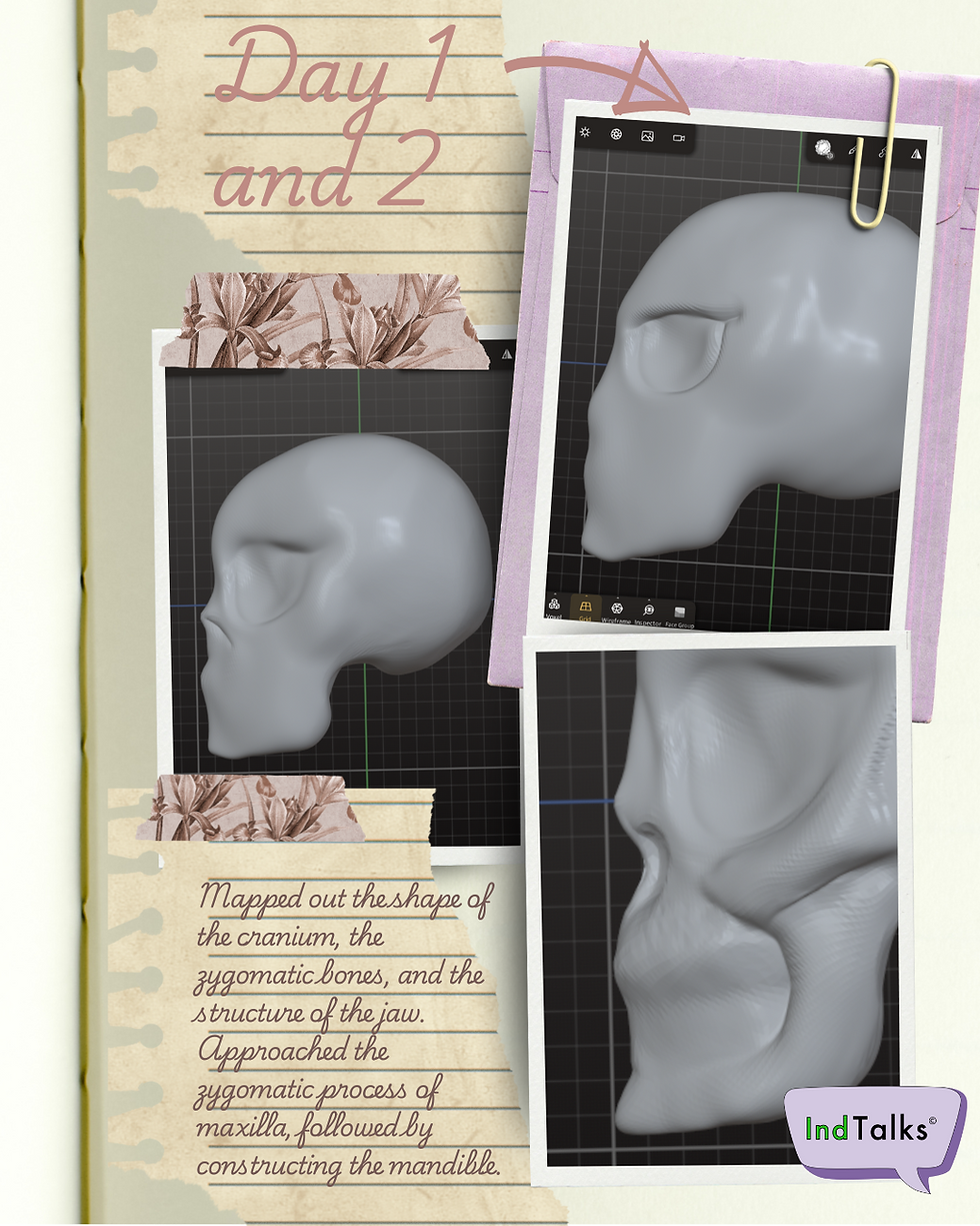
On day 1, I began by mapping out the basic proportions: the shape of the cranium, the zygomatic bones (cheekbones), and the structure of the jaw. I felt the next step for me was to block in the major planes of the skull specifically the orbitals (the eye sockets) and refine the cheekbones.
Following this, I began to carefully render the nasal cavity, at which point once I felt satisfied with the outcome of this, it felt like a natural place to pause.
On day 2 of creating a human skull in ‘Nomad Sculpt’, continuing downward from the cheekbones I approached the zygomatic process of maxilla, shortly followed by constructing the mandible by using the ‘Layer’ tool. I used the ‘Smooth’ tool to soften the sharp edges of the mandible that I had accidentally created.
I then began to use the ‘Flatten’ tool to clear excess ‘clay’ for the area I planned to sculpt the teeth. The teeth were possibly the most challenging area to form.
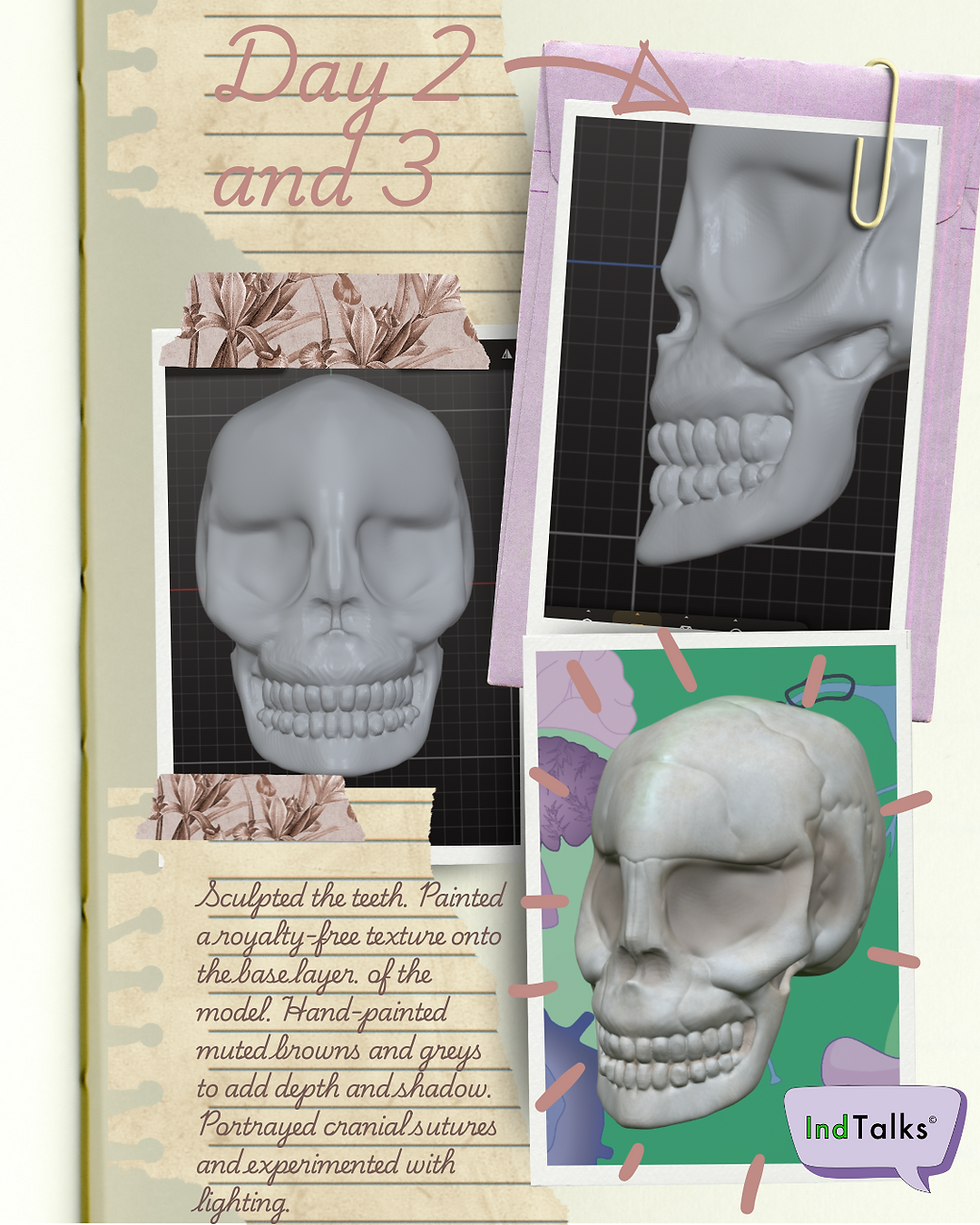
At the end of day 2 I found a royalty-free photo texture of bone and painted it onto the base layer of the model to add more depth and realism. After applying it, I used the ‘Smudge’ tool to blend it manually to match the form of the skull and smooth out any rough transitions.
On day 3, I hand-painted muted browns and greys to add depth and shadow in the orbitals, vomer bone, sphenoid bone and between the teeth. The texture I had created helped the model feel more tactile without overcomplicating the mesh.
I used the ‘Crease’ tool to portray the cranial sutures (fibrous joints), and lastly I experimented with lighting in ‘Nomad Sculpt’ to add a cool tone.
Though I am mostly satisfied with the overall form and proportion in this piece, I do feel I have gained a new appreciation for the surprising amount of structure that the teeth require — it can be tempting to flatten them but they have volume and texture. I have also learnt more about how the zygomatic arch and jaw interact – admittedly this took a few attempts to sculpt correctly and I can appreciate it’s still not 100% accurate, whilst still feeling proud of it.
As this piece of work was done on a whim and more of a test to see what I could do with the tools I had at my disposal within ‘Nomad Sculpt’; next time I’d like to sharpen my overall understanding of cranial proportions and bone structure — specifically focusing on the underside of the occipital, vomer and sphenoid bone. I think with further research and planning this would be possible.


Comments